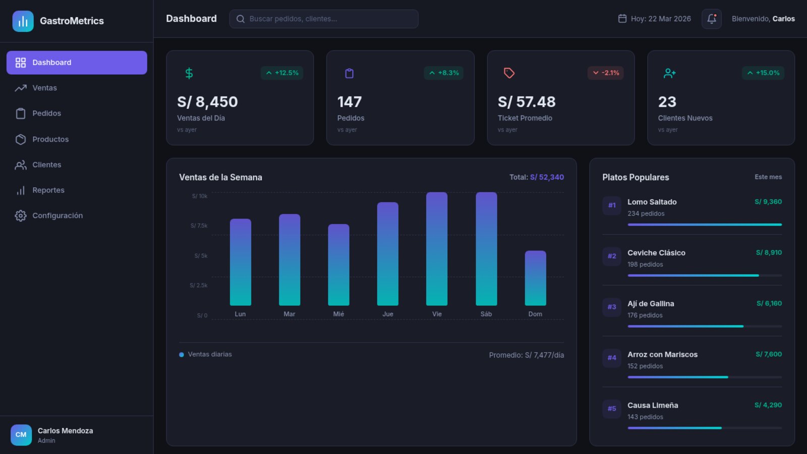
The client worked with its metrics scattered across spreadsheets, exports from several tools and reports someone assembled by hand every week. They wanted a single panel to see what’s happening in the business without cross-referencing files.
The challenge
Every report was hours of copying, pasting and reconciling numbers from different sources. By the time a report was ready, the data was already stale. There was no live view: decisions were made looking at last week’s snapshot.
What we did
We built, to spec, the dashboard the team opens every morning.
- A board with the business’s key metrics in a single view
- Interactive charts with filters by date, segment and source
- Integration of more than five data sources into one model
- Real-time updates, with no reloading or exporting
- Automated reports that generate and send themselves
- Per-user roles and permissions to control who sees what
How we built it
At the core is a layer that unifies the sources into a common data model and keeps them in sync. The interface consumes that model and renders the charts on the fly, with queries designed so the dashboard stays fast even as volume grows.
We took care of performance where it shows: incremental widget loading, caching of heavy queries and efficient chart rendering so filtering never freezes the screen. All built for daily, heavy use, not for a demo.
Results
The team stopped assembling reports by hand: time spent on reporting dropped sharply. The data is live, not days behind, and the dashboard pulls together in one place more than five sources that used to live apart. Decisions are made on what’s happening now.